
A histogram chart is a type of bar chart that shows the frequency or distribution of a numerical variable over a range of values. It can be useful for visualizing the shape, spread, and outliers of the data.
In this article, we will learn how to create a histogram chart in Tableau, how businesses can benefit from using this chart, some interview questions on this topic, and why learning this can help in your career.
Keep on Reading: Tableau Data Analyst Certification Questions »

Desktop Specialist
Learn more about Desktop Specialist Certification.
Data Analyst
Learn more about the Data Analyst Certification.
Server Certified
Learn more about the Tableau Server Certification.
Ready to contribute to the Tableau community? Get $30 for sharing your work and certification experiences. Write and get paid for every article. Learn more »
To create a histogram chart in Tableau, we need to have a data set that contains at least one numerical variable (such as age, income, score) that we want to analyze.
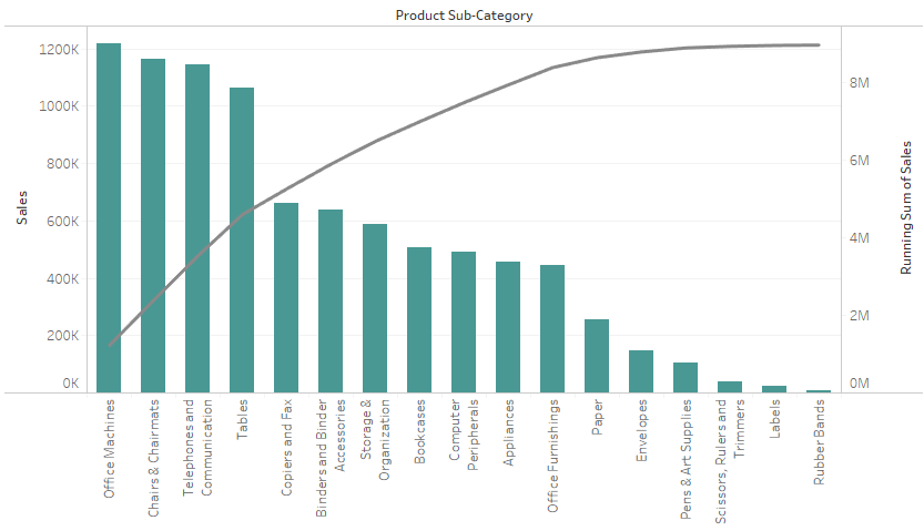
For example, let’s use the Sample – Superstore data set that comes with Tableau. This data set contains information about orders placed by customers for different products across different regions and segments.
We want to create a histogram chart that shows the distribution of sales amount per order.
Here are the steps to create a histogram chart in Tableau:
- Connect to the Sample – Superstore data source in Tableau.
- Drag Order ID to Columns and right-click on it. Choose Measure > Count (Distinct).
- Drag Sales to Rows.
- Right-click on Sales and choose Show Me > Histogram.
- Right-click on Sales again and choose Edit Reference Line. Choose Distribution for Band From and Band To options. Choose None for Label option and Formatting options as desired.
Keep reading: Tableau Desktop Specialist Certification Questions »
Histogram charts can help businesses gain insights into how their numerical data is distributed over a range of values.
For example,
- A retail company can use histogram charts to analyze how their sales amount per order is distributed across different regions or segments or product categories.
- A healthcare company can use histogram charts to examine how their patient age or blood pressure or cholesterol level is distributed across different groups or conditions or treatments.
- A education company can use histogram charts to explore how their student score or attendance or satisfaction rate is distributed across different courses or instructors or levels.
By using histogram charts, businesses can identify patterns, trends, outliers, and anomalies in their data and take appropriate actions or decisions based on them.
If you are applying for a data analyst role that requires Tableau skills,
you may encounter some interview questions on histogram charts.
Here are some examples of interview questions on histogram charts:
- What is a histogram chart and when would you use it?
- How do you create a histogram chart in Tableau?
- What are some advantages and disadvantages of using histogram charts?
- How do you interpret a histogram chart? What insights can you derive from it?
- How do you customize the appearance of a histogram chart in Tableau?
- How do you choose the bin size or number of bins for creating
a histogram chart?
To answer these questions effectively, you should be able to explain what a histogram chart is, how it works, and what it shows; demonstrate how
to create one using Tableau; discuss its pros and cons; analyze its results
and communicate its findings; and apply various formatting options
and techniques to enhance its readability and functionality.
In addition to general interview questions, you may also face some technical round questions that test your ability to create and manipulate histogram charts using real-world data sets.
Here are some examples of technical round questions on histogram charts:
- Given this data set that contains information about house prices by location, create a histogram chart that shows the distribution of house prices by region. House Prices Data Set
- Given this data set that contains information about customer churn by telecom company, create a histogram chart that shows the distribution of tenure by churn status. Customer Churn Data Set
Get our Most Popular Downloads
Download the most popular scenario-based Tableau Workbooks in .twbx format. Used by thousands of Tableau developers and job aspirants every day to improve and fine-tune their CV and Tableau Public profile. Join the largest Tableau Experts Social Group.
Banking & Financial Dataset Analysis
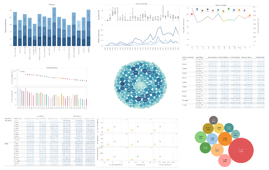
Financial Domain Tableau Dataset and Analysis. The most important domain in today’s industry. Analyze Key Performance Indicators. Discover Risky and Fraudulent Outliers. Download the Tableau Packaged (.twbx) Workbook. Includes a complete Financial dataset analysis. Enhance your Data Analytics experience with our skilled analysis.
Healthcare & Hospital Dataset Analysis
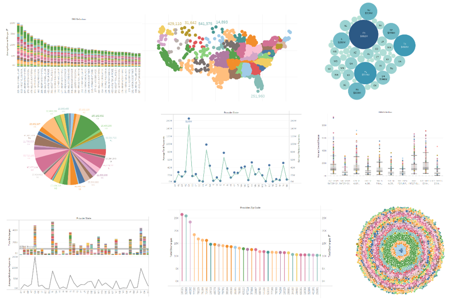
Hospital and Healthcare Domain Tableau Dataset and Analysis. A key field of study with millions of lives at stake. The most sensitive industry today. Download the Tableau Packaged (.twbx) Workbook. Understand how healthcare datasets work. Includes a complete Healthcare dataset with analytical charts. Explore Tableau interactive features with this download.

Insurance Dataset Analysis
Insurance Domain Tableau Dataset and Analysis. Important domain specific metrics and data. Learn how to visualize important metrics. Show outliers and insightful data points. Download the Tableau Packaged (.twbx) Workbook. Includes comprehensive analysis of Insurance data of a large sample population. Uses industry standard analytical practices.


First Working Day of the Quarter
Get the Tableau Workbook identifying the First Working Day of any Quarter of a Year.

By the Editorial Team


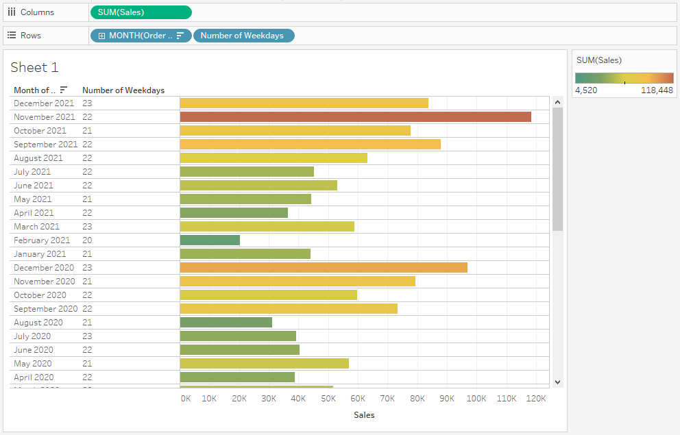


Tableau Practice Test
The best Tableau practice exams built. Period. Explore definitive practical problems created by brilliant Tableau experts.