The Tableau Desktop Specialist Certification Exam tests your ability of using the key analytical features of the tool. Be an expert on Dimensions, Measures, Discrete, Continuous, Joins, Blends, Unions, Sets, Groups, Bins, Histograms, Box Plots and Dashboards with our Learning Plans.

Rich Features
Discover new Tableau features and analytical thinking with every question. Master Tableau Desktop with our Exam Prep Guide.

Tactical Logics
Analyze challenging problem scenarios from apparently simple datasets. Get Tableau Public to improve your data skills.

Discover Insights
Explanatory answers of each question teach you related Tableau concepts. Explore variety of data sources and get a Tableau Certification.
Tableau Certification Exam Rules
The Tableau Desktop Specialist Certification Exam requires you to follow the below rules when taking the test. For questions, email certification@tableau.com or visit tableau.com/certification.
- You need to be alone in a room with no other person present. Before starting the exam the proctor will make sure of this by asking you to rotate your webcam a full circle to get a complete view of the room.
- You need to present a Government-issued Photo ID to the proctor by holding it in front of the webcam.
- Your computer or laptop device must be connected to a power source. Your webcam, microphone, and speaker must remain powered on during the entire duration of the test.
- You may use an external monitor only if – a) The laptop display settings show only a single screen is in use. b) The laptop is closed. c) A webcam is provided from the external monitor. d) An external keyboard and mouse are added.
- Your desk must be clear of miscellaneous items. Else the proctor will ask you justification for each item and why you need it.
- You must be having Google Chrome browser and a stable connection speed. Your proctor will guide you on steps to check your webcam, internet speed, and browser compatibility test. The recommended internet speed is 4 Mbps for download and 2 Mbps for upload.
- Your phones or headphones should not be in the exam area during the duration of the test.
- Your proctor should be able to clearly see you via webcam during the entire duration of the test.
- Your Task Manager should show only Google Chrome and there should be no other running processes. The Proctor will verify this before beginning the exam.
- Your laptop should have Automatic Software Updates disabled. If on a corporate network, ensure there is no connection impact due to the firewall by connecting with your IT department.
Tableau String Calculations
An Introduction to String Calculations
An important topic in the Tableau Desktop Specialist Certification Exam is handling strings in different logical scenarios. When we first think of calculated fields in Tableau, the first thing that comes to mind is numbers, and numbers only. But the functionality of calculated fields are infinite. One type of calculated field that you should definitely pay attention to is string calculations. These calculations let you compute strings fields, in other words to compute text.
In this article, we will go through a brief introduction on what string calculations actually are, most commonly used string calculations in Tableau and how you can use string calculations in order to create a custom segmentation in Tableau.
Little More About String Calculations
String calculations allow you to manipulate string fields, or to clarify fields that contain data made of text.
For instance, imagine having a field that contains the first and last names of your customers. The handling of names is a common scenario in the Tableau Desktop Specialist Certification Exam. Let’s take one customer, Michael Stevens. For the sake of your analysis, you just need the first name of all of your customers. For that reason, you need to create a new field using a string function. Creating string calculations requires the same steps as creating other calculated fields. In this case, you can use the SPLIT function in Tableau.
= SPLIT([Customer Name], ' ', 1) = ‘Michael’
The reason why these calculations are less known than the integer ones is because usually, SQL is a better option for doing manipulations with the string fields. Remember that in some cases, just because we are able to do something in Tableau, does not necessarily mean that we should actually do it since it may be a bit more complex and less efficient option.
But overall, there are many good reasons why you should create string calculations within Tableau. Tableau presents an excellent tool for testing your approaches before permanently applying them as part of your ETL process. In other words, you can use Tableau to test segmentations before applying the changes in SQL.
Most Commonly Used String Calculations in Tableau
In the following paragraph, we will go through the most common and extensively used string functions in Tableau.
STR ()
The aim of the STR() function is to customize fields that have been defined as integers, but they don’t represent a certain numerical value. To clarify, this function is used in custom calculations to convert these fields into strings. These fields are dates or measures. Let’s take a look at ‘Order Date’. This field is previewing as an integer, but it is actually a date not a numerical value, so it needs to be converted to string. That being said, right-click on ‘Order Date’, select Create, and then Calculated Field.
Next, insert ‘Order Date’ into the parenthesis as an argument into the STR() function.
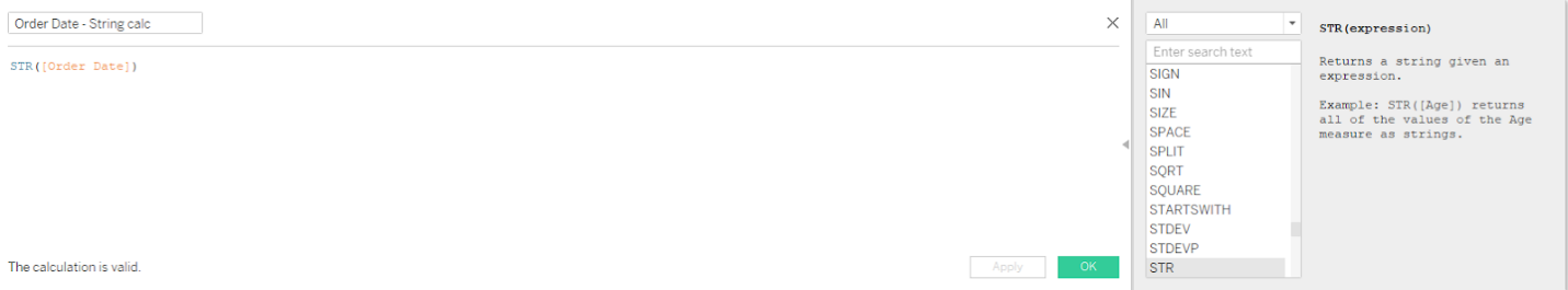
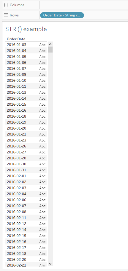
In order to check the result, you can drag the newly created field into the Rows and verify your output. The STR functions come in handy in various scenarios during the Tableau Desktop Specialist Certification Exam.
SPLIT
With the help of the SPLIT function, you are able to split a single value into two or more parts. We will be taking ‘Order ID’ for an example, since this field consists of string values that can be splitted into parts. An example of the ‘Order ID’ field can be seen below.
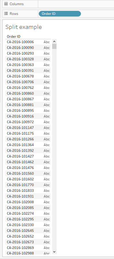
In order to do the split, you need to right click on the ‘Order ID’ field in the Dimensions shelf, click on Transform and then Split.
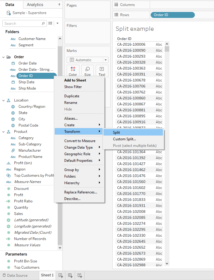
By doing everything described above, you will perform the split and that will result in three parts as shown below. So, the actual first part of this split is the string, the initials like CA. The second part represents the year, and the third one, a certain number.

Each of these splits, has a calculation behind it. If you right click on it, you can see the actual executed calculations. That way you can learn how to manually do these splits as calculations. For example, let’s take a look at the first part of the split, the string.

First, the TRIM() function is used in order to remove the extra spaces in between. Next, the SPLIT function also uses the arguments “-” as a delimiter in between and also, a split point for dividing the characters into different parts.
The calculation for the second part is as follows. The calculation for the third one is exactly the same, only instead of 2, we put 3.
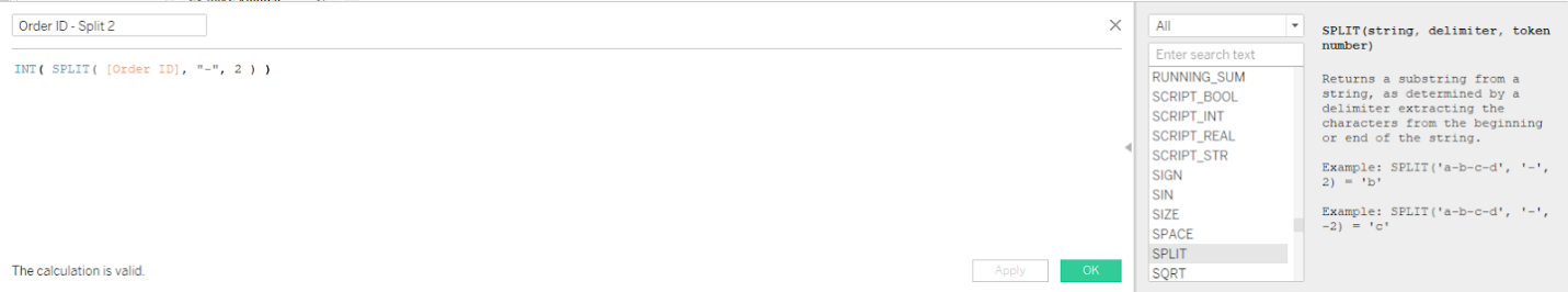
Both, the second and the third calculation are using the INT function that is converting the value as an integer.
Below, you can see the actual output of the SPLIT. It is useful to be in control of this function prior to the Tableau Desktop Specialist Certification Exam.

Contains
The CONTAINS () function will be a lot of help in cases where your goal will be to extract only specific portions of the string value. For a practical example, we would take the ‘Product ID’ field. In this case, our aim is to preview only those products that have the part ‘FUR’ in their product ID. To clarify, we want to display only those products that are under the furniture category.
In order to do that, first we need to right click on the ‘Product ID’ field in the Dimensions shelf, select Create and choose Calculated field from the options. The formula is shown below.

As we can see, in the calculation above we state two arguments. The first one is the ‘Product ID’ variable as the string, and the second argument is FUR acting as a substring. Then, you should click OK and drag the calculation to the Filter shelf. Select TRUE like in the image below.
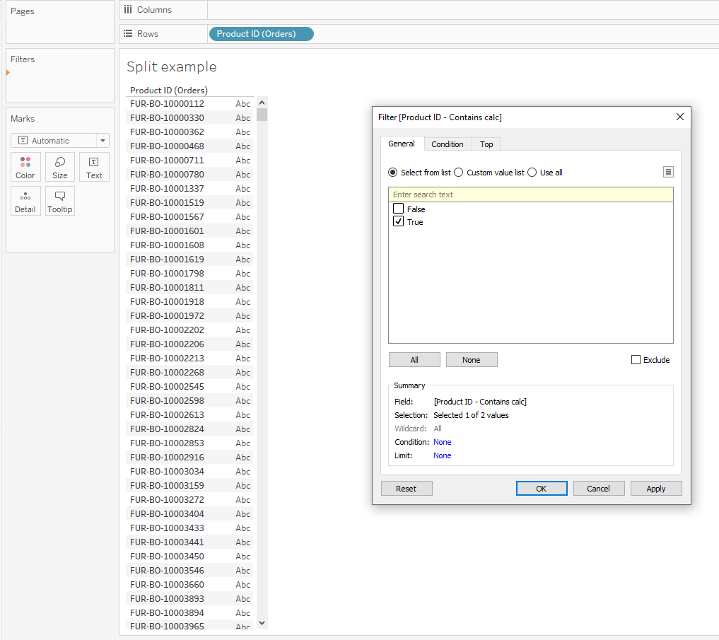
Now as we can see in the view itself, only the products with FUR in their Product ID are previewed.
These are only the most commonly used functions in Tableau for converting to string values, even though the range of available functions is very broad.
Next, we will proceed with going through an example in Tableau with the help of STARTSWITH function.
A Practical Example Using The STARTSWITH Function
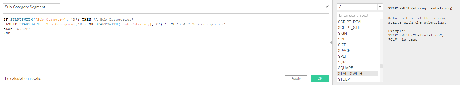
Let’s say that our goal is to create a custom segmentation within the Sub-Category dimensions ( from the Sample - Superstore dataset). We want to group our sub-categories depending on the first letter. That being said, sub-categories that start with an ‘A’ will be one segment, starting with ‘B’ or ‘C’ another, and everything else as another, final segment.
One thing that may come to your mind is that we can easily solve this by grouping the sub-categories, but groups are a static solution. In that case, if we update our dataset afterward and new dimension members are added, the change will not be automatically displayed. As a contrast, string calculations are a dynamic solution. We can set them once and then we can be sure that as the new data is added, the segments will be dynamically updated.
The formula for this solution is shown in the screenshot below. Please note that the STARTSWITH function is not case sensitive.
The way we do quality checks for string calculated fields is the same as we do a quality check for calculated fields with numbers. We should put the original Sub-Category dimension on the Rows shelf and that one should be followed by the newly created calculation, Sub-Category Segment.

The first column represents the original dimension member, while the second one displays the segments that we have calculated. As we stated above, if a sub-category starts with an ‘A’ it is grouped under ‘A Sub-Categories’. If a sub-category starts with ‘B’ or ‘C’, it will be grouped as ‘B & C Sub-Categories’. Everything else is classified as ‘Other’. Since the calculated field is working, we can proceed to using it independently along with the measures. For example, creating a bar chart that shows sales by Sub-Category Segment.
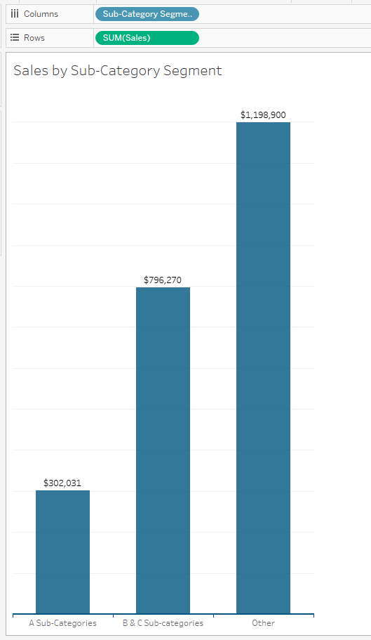
We can immediately spot that the ‘Other’ sub-category is definitely leading, compared to the others.
For the sake of simplicity, this calculation was really quick and easy to do in Tableau. But if you want to make some changes to your dimensions permanently, try to move this calculation outside of Tableau. To clarify, when you decide to use this segmentation frequently in your analysis, add it as a column to your dataset before uploading the data to Tableau.
The reason is because string data type is the slowest one for processing when it is added to Tableau’s view. But either way, Tableau is a great tool for testing the solution before adding it to your data set. It is a quicker alternative for repetitive and slow queries. As we practice more with these functions, we will be ready to solve the practical problems for the Tableau Desktop Specialist Certification Exam.
Tableau Text Table Types
An Introduction to Text Tables
Tableau is one of the world's most popular data visualization tool. Tableau helps people see and understand their data, but you need to know the why and the how behind data and analytics in order to be effective. Analyzing complex scenarios in the Tableau Desktop Specialist Certification Exam can be efficiently done with a few key tactics using Text Tables. These concepts will give you the knowledge to know what Tableau is going to draw on the canvas before you even drag and drop a pill, and it will empower you to be successful when communicating about data with your users. Having basic analytics acumen would be helpful, but if you are a beginner, you can still be successful with this course.
Let’s learn how to quickly display data with variations of the text table in Tableau. We'll start as simple as it comes, by building a standard text table. And then, we will transform that into chart types such as a highlight table and a heat map.
Text Table
Text table is an arrangement of columns and rows that organizes and positions our data. Columns or rows can contain headers, which describe the values in each cell. Other common names for text tables are simply the table, a crosstab, or a pivot table, depending on how it is structured. We use text tables in our everyday lives and we may not even realize it. Have you ever looked at the box score of a football game? Or maybe checked the performance of your favourite data stock? These are simple but effective text tables, and we use them all the time.
Pros and Cons of a Text Table
Pros
- Easy to comprehend
- Even multidimensional tables have simplicity
- Allows for precision
Cons
- Difficult to shape the data or identify patterns
- Not good for dataset of big size
- No visual appeal
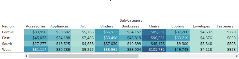
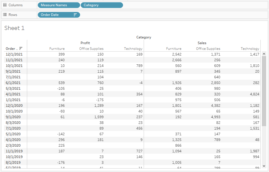
Now let's jump into Tableau and learn about how to build every data analyst's least favourite chart. Select the Superstore in Tableau as a data source to practice. Navigating to the top left of Show Me, we see that a text table requires one or more dimensions or one or more measures. Now select Region, press Ctrl key and select Sub Category and Sales from measures. Now click on text table from Show Me. Now to eliminate scrolling, click on Swap Rows and Columns button on the toolbar. Below is what you get:-

This is an example of a simple text table. But as you notice, it is difficult to answer some important questions looking at this table. Questions like which Sub Category has the highest Sales and in which Region. To be able to answer questions like these, the user will have to browse through the Sales amount of each Sub Category, in each Region and then compare them to get the highest Sales. This can be a challenge during the Tableau Desktop Specialist Certification Exam. This is a lot of time-consuming even with a small data set like shown above. Imagine this visualization with a dataset containing millions of records. Can’t imagine, right?
Now let's move on to our next chart type, the highlight table.
Highlight Table
The main purpose is to compare categorical data using color. The color identifies pattern or correlation in the data, and you can use this chart type with or without labels. Also referred to, by the rest of the world, as heat maps. But according to Tableau heat maps are different than highlight table.
Pros and Cons of a Highlight Table
Pros
- Easy to comprehend, similar to a text table
- Helps identify patterns or correlations, using color
- Visually appealing
- Allows scaling for big dataset
Cons
- Good to work with 2 dimensions but becomes hard for more dimensions
- Not good for pointing out small variations in the data
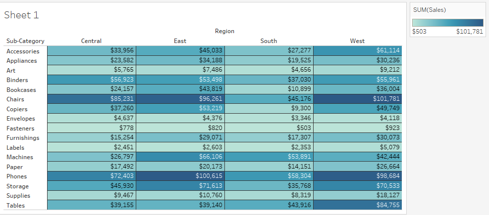
Now we're going to prove that. Let's open up our friend Show Me and see the suggestion for a highlight table. We can see that a highlight table requires one or more dimension and exactly one measure. We can see that there are only two configuration changes when we move from a text table to a highlight table. Sum of sales has been replicated onto the color property of the marks card, and the mark type has been changed to Square instead of Text. Since the highlight table is a text table under the hood, there is not much difference between the two. Below is how the highlight table looks:-
Hmm, it’s taking shape!
We can declutter this view to bring out the colors even more. To do this, just drag Sales off of the text detail. If the colors feel a little overwhelming, there's no shame in adding a subtle border around each cell. Click on the Color property of the marks card. Select the Border drop-down and choose a color that closely matches the background of your view. You can see our colors are now packed into a tighter area, which should lighten our mental load when trying to compare colors. The only item worth changing at this point is the orientation of our column headers. It is usually preferred to lay out headers horizontally, but in some scenarios we are forced to display headers vertically. Right-click on any of the column headers and select Rotate Label. You can drag and drop to resize as necessary. When displaying labels vertically, we want to make sure they line up with the first cell, so right-click, again, on any of the column headers, click Format, and change the Vertical alignment to bottom rather than middle. Below is how it looks now:-
Looks much better than text table, right?
Such approaches often help derive answers faster during the Tableau Desktop Specialist Certification Exam. We can now see the final representation of our highlight table, and it is impossible to miss insights like phones having high sales across all regions, or envelopes being one of the lowest sub-categories in terms of total sales. I'm sure we don't expect envelopes to bring in the same amount of revenue as phones, but are those sales profitable? We'll answer questions like these in the next clip where we'll explore variations of the heat map.
Heat Map
Since most of the world would consider a highlight table to be a heat map. But Tableau considers a heat map to use size, to identify patterns or correlations in the data, and optionally color can be used to identify another pattern or correlation, as we will demonstrate here shortly in the demo.
Pros and Cons of a Heat Map
Pros
- Easy to comprehend , similar to a text and highlight table
- Helps identify patterns or correlations, using color
- Important data can be easily recognized
- Allows scaling for big dataset
- Visually appealing
Cons
- Good to work with 2 dimensions but becomes hard for more dimensions
- Not good for pointing out small variations
- Size legend may not point out extreme outliers in the data
Now, let's jump into Tableau and learn about how to build a heat map. As we did in the previous section to access Show Me and hover over the heat map thumbnail, we would see that we can build a heat map with the level of detail already in our view. We can click the icon in Show Me to see how Tableau wants us to build the heat map, or we can do it ourselves by simply moving sum of Sales from Color to Size in the marks card. From here, we can alter items such as the size range, making the smallest and largest marks bigger or smaller. We can also reverse the order if you want to bring attention to your smallest values rather than your largest.
If you remember, in Show Me, the configuration was suggesting one or two measures. The heat map will provide us additional insights if we add another measure to the color property. Let's drag and drop Profit Ratio onto color and see if any insights stand out. Our squares remain sized by the sum of sales, but are now being enhanced with profit ratio on color. Below is what we get:-

By adding Profit as an additional component, we can see that Paper is a low-revenue sub-category, as indicated by the small size, but it is actually the most profitable, as indicated by color, while Tables are high-revenue, but very unprofitable. There isn't much else to configure to consider our heat map a success. As always, feel free to play around with your Fit window, as what works for one chart type doesn't always work for the next. When working with size, I like to give my marks a little extra room to breathe. So in this case, I would suggest not squaring your cells as we did with the highlight table. As usual, you can drag and drop until you are content.
Now that you are familiar with the different variants of text table and the pros and cons of each type of text table, hope you would find it easier to choose which visualization to use in a report according to the dataset and requirement during the Tableau Desktop Specialist Certification Exam.
Tableau Calculated Fields
Overview
One of the great things about Tableau is that authors are able to create completely new data, new KPIs from the already existing data by using calculated fields. Using a calculated field can often be useful during the Tableau Desktop Specialist Certification Exam. With the help of calculated fields you are able to create new dimensions like segments, or new measures, such as ratios. The functionality and flexibility of the calculated field is virtually limitless. You can create calculated fields by using any data type, a mass of different functions and aggregations or logical operators.
The aim of this article is to introduce calculated fields to you by a short introduction and walk you through some practical examples using the Sample - Superstore dataset.
What is the benefit of using calculated fields?
Understanding calculated fields from different perspectives is useful for the Tableau Desktop Specialist Certification Exam. You are probably thinking why calculated fields are so admired between the analysts? Most important of all, calculated fields help you create information as a result of your data. Let’s take a simple example. In your data source, you have two measures, Revenue, and Cost. Those numbers for you present data. Looking at them individually, may not present any valuable information for you since you are looking at them in an absolute manner and do not have a relevant threshold available. But creating a calculated field, ROI, where you will be dividing the total revenue with the total cost is the next level. Now, you have created information. You are able to see if you have generated enough revenue compared to your investment, your cost. Please note that before uploading your data to Tableau, we would suggest preparing it as much as possible and including all the required fields for your analysis.
There are many ways how you can take advantage of the functionality of calculated fields in Tableau. Here are some:
- You can segment your data in many different new ways
- Before making field a permanent in your underlying data, you can first of all create a middle dimension or measure to test its functionality or prove a concept
- You can filter some of the data, such as limiting your data only for this year, for more efficient analysis
- You can use the power of Tableau parameters and make your data more interactive for your end users
- You can create many different KPIs in Tableau, that will save significant database processing and also, storage
A brief introduction to calculated fields
In order to understand how the calculated fields work, it is best to go through a practical example and see how from the data that is available, we would be able to create informative content that can bring value to our analysis. For the sake of the example, we would be using the Sample - Superstore dataset from Tableau. Let’s say that the aim of this analysis is to calculate the Profit per order (PPO) overall, and then evaluate this KPIs separately for each Product Subcategory we manage. PPO is calculated as total profit divided by the number of orders. Now, note that even though this data source has Order ID as a dimension, we need the number of orders presented as a measure. This is really important since this measure is the denominator for the PPO calculation.
In order to get the number of orders, we would first need to create an additional calculated field that will count the number of orders. The formula available at Tableau that will assist us with this is COUNTD of the Order ID dimension. To create a calculated field, you can either:
- In the top-right corner of the Dimensions Shelf, you can click the down arrow and select ‘Create calculated field’
- You can easily just right-click on a blank space on the left sidebar and ‘Create calculated field’
- In the top navigation bar, click Analysis and choose ‘Create calculated field...’
- Or, if you know which field you would want to use in your calculated field, right-click on that field, click on ‘Create’ and choose ‘Calculated field...’
Since in order to calculate the total numbers of orders, we need the Order ID field, we can just go to that field. We start the calculated field by right clicking on the field Order ID in the Dimensions Shelf, then ‘Create’ and choose ‘Calculated field...’. As a result, a new box will appear where we can apply the formula.
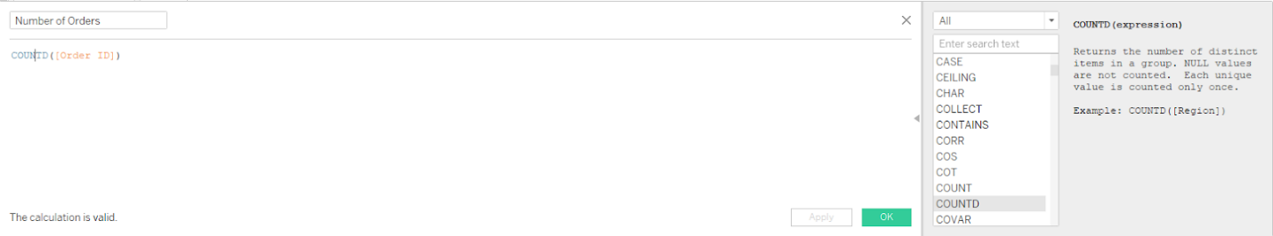
Another thing cool about Tableau is that it offers a definition for every formula that you are able to use on the right-hand side of the calculated field. Make the most of it during the Tableau Desktop Specialist Certification Exam. So to clarify, every time you see a blue color-coding while creating a calculated field, you can just click on the blue-colored word and you will obtain a definition and a relevant example of that function. This is a good way to learn the syntax. On the screenshot above, you can see the whole definition for the COUNTD expression. This may help you distinguish the difference between formulas if sometimes, you are in doubt about which one to use. After you click the OK button, a new measure ‘Number of Orders’ will preview on the Measures shelf that we can use throughout the workbook.
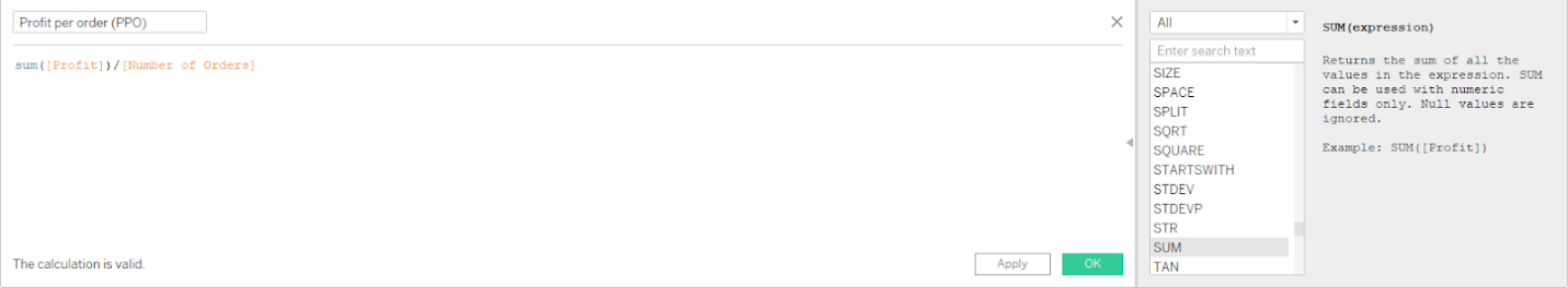
Now, since we have the number of orders, which is the denominator for the PPO calculation for which we are after, we can create another calculated field. Here, we will divide the total profit with the number of orders. In order to start this calculation, we can click on the drop arrow in the Dimensions shelf and choose ‘Create calculated field...’. Again, a blank dialog box appears where we can enter the formula for calculating the PPO.
Just a small tip. If you click on the orange-colored measure ‘Number of Orders’ you will be able to see the formula behind it on the right-hand side as well. No need to open the field only for that particular reason.
One thing that we can notice is that the measure of ‘Profit’ is aggregated as SUM, but the ‘Number of Orders’ clearly has no aggregation connected to it. The reason behind this is that the Number of Orders field already has an underlying aggregation - the usage of COUNTD in the previous step. You should always remember that Tableau does not allow mixing aggregated and non-aggregated fields within one calculated field. So, if you don’t aggregate the ‘Profit’ by adding SUM, Tableau will display a red indicator at the bottom meaning that that certain calculated field is an invalid one. In order to find out why a calculated field is invalid, you can click on the error message.
Another thing tricky is that sometimes even if a calculation is valid in terms of the syntax, it may not be correct regarding the result that you are experiencing. In order to check the quality of a calculated field and ensure that everything is calculated correctly, we suggest you put the raw data onto the view and do the calculation manually. In this particular case, we would create a quick view that will show the number of orders, the total profit and the newly created PPO measure. Then, manually we can divide the profit with the number of orders. If the correct answer is reflected as PPO, we did everything right.
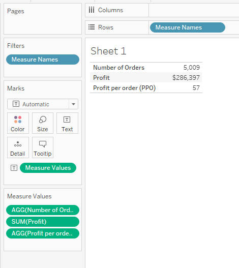
As we can see in the screenshot above, it looks like we did get the correct answer: $286,397 in profit divided by 5,009 total orders equals the profit per order of $57. By default, calculated fields do not come up with a relevant number formatting. PPO, which should be displayed in dollars as a currency, is just a bare number. In order to change this, we should right-click on the calculated field in the Measures Shelf, hover over ‘Default properties’ and choose ‘Number format...’
Something More On Aggregating Calculated Fields
Aggregation Is something you should always keep in mind when creating a calculated field. The Tableau Desktop Specialist Certification Exam has a variety of scenarios on this logic. For example, a calculated field for SUM([Sales]) / SUM([Quantity]) will present a very different answer than the same calculation without the aggregation, like [Sales] / [Quantity]. Even though, both calculated fields will appear as valid. So what happens is that, without adding an aggregation, Tableau will just apply the calculation to every record in your analysis. The data will not be aggregated until you add the calculated field to the view, when it will previewed as a summary for all rows together. Before integrating a new measure to your dataset, always make sure to do a quality check to your calculated fields and be sure that you are seeing the results that you are expecting.
Now let use our newly created calculated field into work. By using the PPO, we should answer our business question: What is the Profit per order (PPO) of the product sub-categories we manage compared to all the others?
To be able to answer this, we need to create a third calculated field ‘Sub-Category Segment’. For the sake of the example, we would choose the Chairs, Binders and Supplies as products we manage.
In this calculation we will incorporate the IF/THEN logic to create a segmentation. In the formula, we will have one segment for the product sub-categories that we manage and the other segment for every other sub-category marked as ‘Other’.
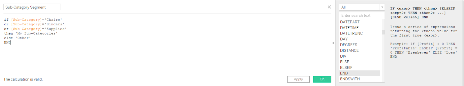
What this calculation is actually saying is that if the dimension member of Sub-Category is chairs, binders or supplies, we want all of that to be classified as ‘My Sub-Categories’. Otherwise, it should be marked as ‘Other’. In order to do a quality check on this calculated field, we should put the original dimension on the rows shelf, and right next to it, the newly created calculated field.
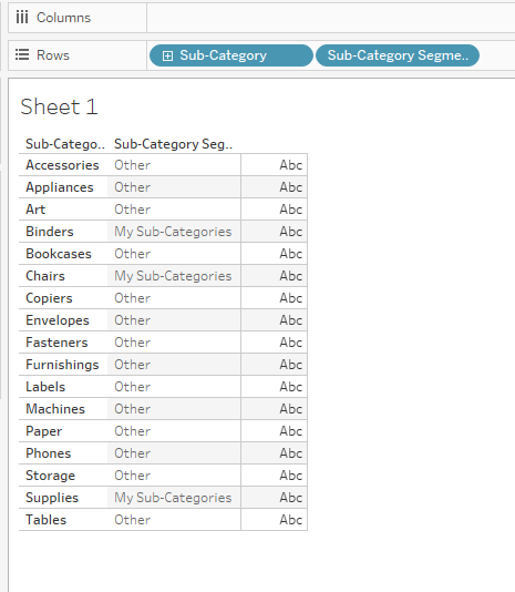
So, we can see that our calculation is accurate and everything looks good. Our three sub-categories are classified as ‘My Sub-Categories’ and everything else is marked as ‘Other’.
As you can see, our thee sub-categories are marked as “My Sub-Categories” in the second column, and everything else is classified as “Other”.
Now we are ready to give answer to the business question above by adding the PPO on the view and then, slicing the measure by Sub-Category Segment dimension.

Unfortunately, we can see that the PPO for the product sub-categories we manage is much lower than the PPO for all other sub-categories. We should focus on improvement.
Tableau Discrete & Continuous
Discrete and continuous values in Tableau - ‘Blue pill’ vs ‘Green Pill’
Every time you connect to a new Data source, each field is being assigned by Tableau whether as dimension or measure depending on the data type that the certain field contains. To build a view of our data, we use these fields. It's essential to have a clear understanding of these fields for the Tableau Desktop Specialist Certification Exam.
These fields are based on the columns in your data source. Each field has its own data type (such as integer, date, string etc), and a specific role: Discrete or Continuous.
One thing that is an essential while working with Tableau is knowing the difference between discrete and continuous fields.
Being able to clarify the difference between these two fields, means that you will be able to know before-hand what type of visualizations you can create and how they will actually look like. Having a good understanding of what this distinction actually means, present the basics of your Tableau knowledge.
The color of the field is the first key that will help you determine if a field is being used as a discrete or a continuous one. Blue color indicates that a certain field is discrete, while on the other hand, the green one indicated that the field is continuous.
Most of the people that start using Tableau make the first rookie mistake - they assume that these colors represent whether the field is a dimension or a measure. Don’t worry, you’re not alone on this one. Actually, the most common myth in Tableau is considering the blue fields as dimensions and the green ones as measures. We can expect variations of such conceptual problems in the Tableau Desktop Specialist Certification Exam.
Even though, at some point, this kind of thinking makes sense. By default, the dimensions are classified as discrete variables. They are accompanied by a small blue icon in front of them, in the dimensions shelf. On the other hand, measures are classified as continuous variables and have a small green icon in front of them in the measures shelf. But here you have outlaws. Even though it is more rare, you can also have Continuous Dimensions (dimensions that are strings or Boolean data type, cannot be continuous) or Discrete Measures.
So one thing we learned so far is that the color-coding in Tableau or well-known as ‘blue pill’ vs ‘green pill’ due to the field's shape, indicates discrete vs continuous fields. Not dimensions vs measures. This clarification is important since measures can actually be used both ways, as a discrete field or continuous field. The same is true for some dimensions as well, for example dates.
Since we got the basics, we can move on defining what actually discrete and continuous mean.
Discrete data, the ‘blue pill’, is defined as values that can be counted as separate and distinct. The distinct data can only take individual values within a certain range. For example, customer name, customer ID, State etc.

Continuous fields, the ‘green pills’, measure continuous data, on the other hand. They are infinite values that can take any value from a certain range. For example, profit, unit price or product quantity.

If a certain field has values in it that are numbers that can be somehow aggregated, averaged or summed, by default this field will be added as a measure field in the Data pane. Please note that even if a field contains numbers, that doesn’t need to imply that these values are continuous. Postal codes are just one example. Even though they are numbers, they are actually string values. They can not and should not be added or averaged. But if the numbers inside the field can be somehow aggregated, Tableau will assume that the values are continuous. Otherwise, If a field has values that are anything other than numbers like dates, names, or geographical locations, it is automatically placed as a dimension field in the Data pane. Tableau treats these values as discrete.
What are the main differences between discrete and continuous values in Tableau?
By making sure that you know at all times what kind of data you are using, Discrete or Continuous, you can easily recognize the limits or possibilities of what you can do with it. The real question here is, what does this mean for your visualizations? We will illustrate a few examples where discrete data and continuous data act differently when previewed visually.
Headers vs values on axis
The main difference between the continuous and discrete fields is that they have different effects when you put them on different locations. When you put them in rows and columns, the discrete values are treated like headers. That is how the Tableau actually breaks down the data into tables and charts. On the other hand, the continuous data is shown on axis, like many values in a range. Those are the values and the metrics that fill out the table and the charts.
We would take an example of one field shown both way, as a continuous one and a discrete one.
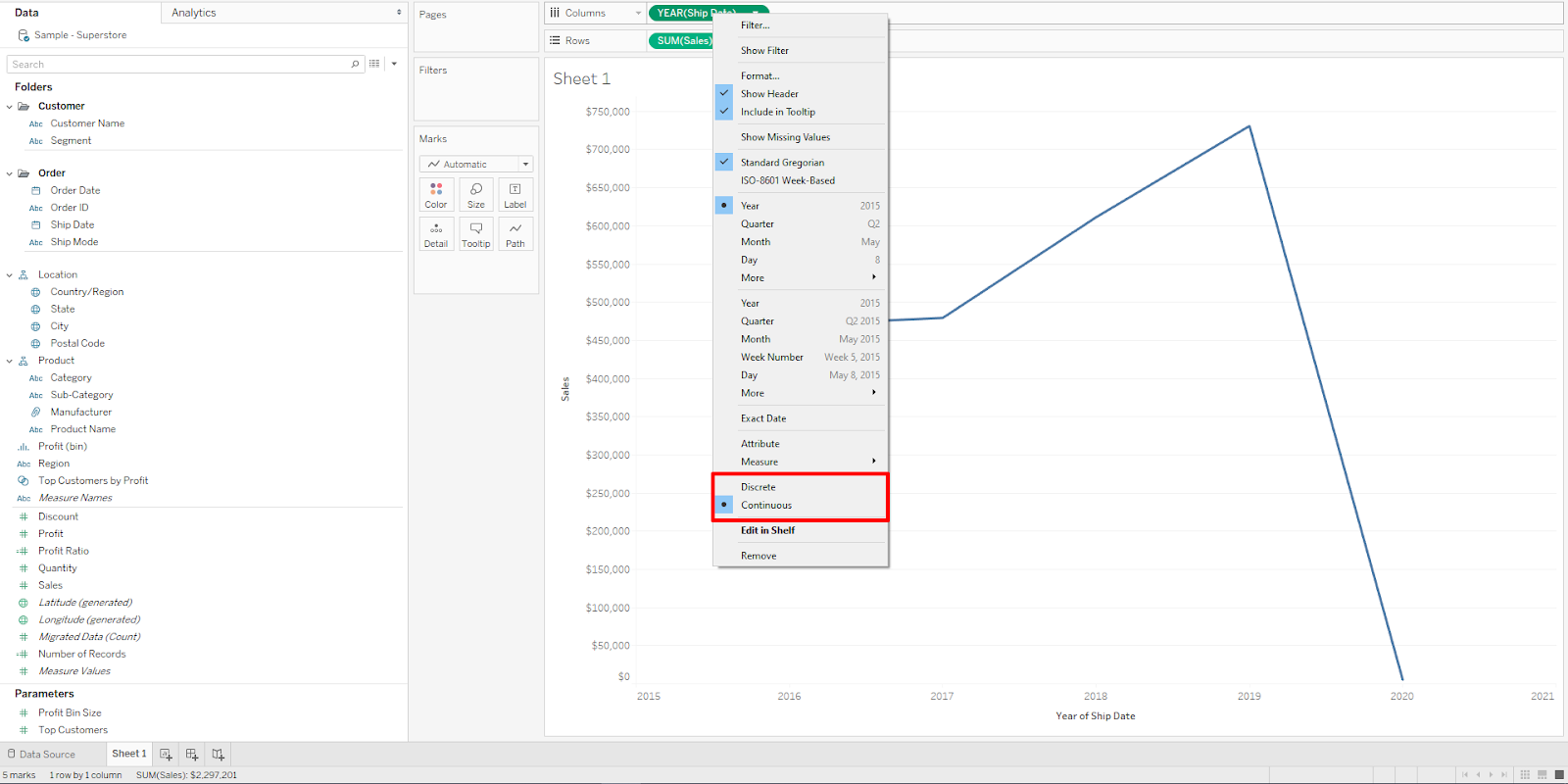
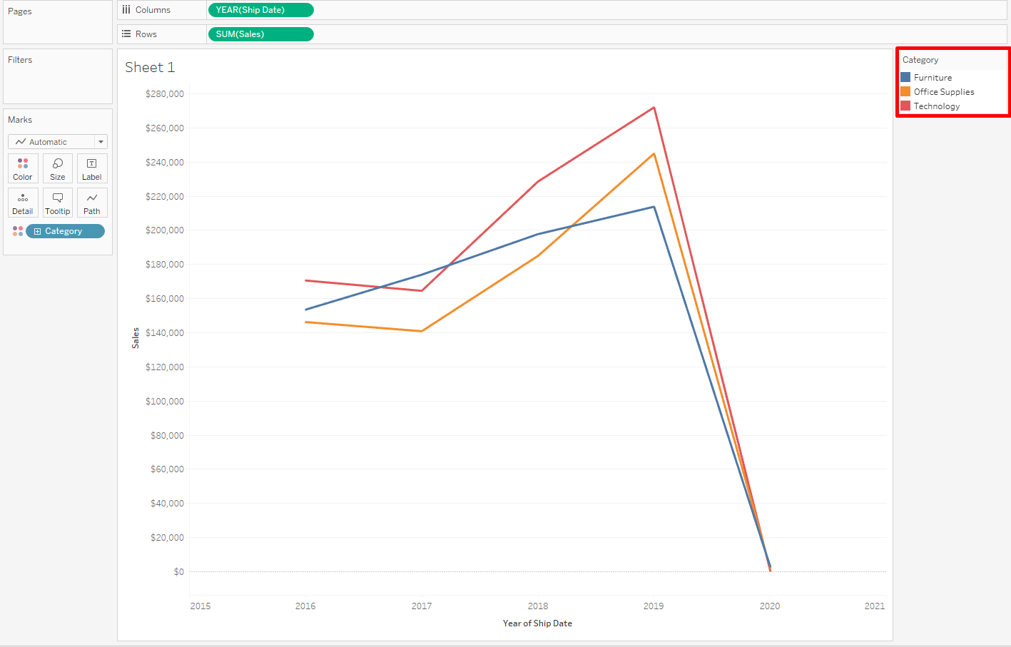
First, we will set the field Ship Date to Continuous. As a result, along the bottom of the view, it creates a horizontal axis. An axis is defined as a measuring line that preview values between a minimum and a maximum. The field is shown with a green background which helps us to indicate that this field is a continuous one. In the bottom left corner, we can see that Tableau has created one row and one column.

In the second example, the field Ship Date is being set to Discrete. Instead of a horizontal axis, now the field created horizontal headers along the bottom of the view. The blue background and the headers as well, clearly indicated that this field is Discrete. In the bottom left corner, we can see that this Tableau has created one row and seventeen columns. The number of the columns depends on how many dates you have.

The interesting thing about the fields that present Date is that they can be both, Discrete or Continuous. If we right-click on the field itself, a dropdown menu will appear and we can choose which option we want.
If we want to see the course of change over time, we should set Shipping date as a Continuous field because that way we will be able to see the data over an uninterrupted period of time. By default, when we first add the field to the view itself it will be set up to Year. Then progressively, we can expand it to quarters, months, weeks or days.
If we decide on using Shipping Date as a Continuous Dimension, we will be able to only use Year because the flow of data continues over an uninterrupted course of time. This means we are allowed to see the course of change over time, not anyway different. This means that we can’t compare the results of the subdivisions – quarters, months, weeks, days in this view because they would break the continuity.
But if we wish to examine the sub divisions individually, for example sales per month, we should consider setting Shipping Date as a discrete one. That way, we will be able to split the data and see it grouped as we want it. In other words, we would break the continuity.
Checkbox or list vs Range or scale
When a discrete dimension field is dropped in the Filters shelf, first Tableau asks you to choose which members of the discrete field you would want to include in the view itself. So the discrete field since they contain finite values, they create a checkbox or a list of values.

When a continuous measure is placed in the Filters shelf, Tableau first of all lets you choose an aggregation for the filter. Then, Tableau prompts you to specify exactly how to filter the continuous range of values.

Fixed colors per value vs Spectrum of colours
When you place a discrete field on Color in the Marks card, Tableau first of all assign a color to each value of the field. This is available with discrete fields since they contain separate and distinct values, where every one of them can be looked individually. In other words, Tableau displays a categorical palette that you can change afterwards based on your needs.
When a continuous field is set on Color, Tableau displays a quantitative legend. Since the values in the continuous fields can not be looked at separately and are unbreakable, Tableau provides you with a continuous range of colors. One color displays the maximum value, one color the minimum value and all other values in between are where the colors blend between each other. You can then set manually the colors manually and also, decide a middle value for your range so the colors can blend properly.

Conclusion
Now that you are able to clarify the difference between the Continuous and Discrete fields, you can know before-hand what type of visualizations you can create and how adding these fields will impact the view in its own way. Having a good understanding of what this distinction actually means will help you dive deep into the Tableau waters of knowledge and score well in the Tableau Desktop Specialist Certification Exam.
Exceeded Max Attempts above?
Includes Free Tableau Desktop Specialist and Tableau Certified Data Analyst Certification Practice Tests
Precise Tips for the Exam
01
Awareness
Deep dive into every topic of the Tableau Desktop Specialist Exam Guide. Get the Exam Guide here.
02
Learning
Enrich yourself with the crisp Official Tableau Tutorial Videos. Stress on the Tableau Help Guide.
03
Key Areas
Read in details on Connection Types, .TDS files, Blend, Join, Set, Group, Chart Types, Filters, Trends.
04
Practice
Hands-on experience is critical. Take as many practice tests as possible prior to the main exam.

Value of the Certification
The Tableau Desktop Specialist Certification is deeply recognized in the Data Analytics world. It establishes your proven skills and analytical ability.

Official Exam Guide
Download the Official Tableau Desktop Specialist Certification Exam Guide. Review all the topics and sample questions.

Cost of the Certification
The Tableau Desktop Specialist Certification cost is $100. The exam can be purchased at Pearson VUE.

Validity of the Certificate
The Tableau Desktop Specialist Certificate does not expire. It is a permanent value-addition to your CV and job profile.
What Our Test Takers Are Saying
JOHN G.
I was preparing for my Tableau certification. At first, I couldn’t believe when I saw a free full examination for Tableau! Thank you.
ANNA L.
My job required me to get the Tableau Desktop Specialist Certification. You membership plans helped me get it so quickly! Thank you!
NADIA P.
I have been working in Tableau last 4 years. Thought to get certified. Your questions made me reevaluate myself. Interesante!

Visual Best Practices
The Tableau Visual Best Practices Guide provides you with an in-depth understanding of choosing the right chart types. Optimize your dashboard design and achieve perfection.

Tableau Desktop Guide
The Tableau Desktop Help Guide is the ultimate resource for all solutions. A remarkable storehouse of essential information at the core of every successful Tableau professional.
Get our Most Popular Downloads
Download the most popular scenario-based Tableau Workbooks in .twbx format. Used by thousands of Tableau developers and job aspirants every day to improve and fine-tune their CV and Tableau Public profile. Join the largest Tableau Experts Social Group.
Banking & Financial Dataset Analysis
Financial Domain Tableau Dataset and Analysis. The most important domain in today’s industry. Analyze Key Performance Indicators. Discover Risky and Fraudulent Outliers. Download the Tableau Packaged (.twbx) Workbook. Includes a complete Financial dataset analysis. Enhance your Data Analytics experience with our skilled analysis.
Healthcare & Hospital Dataset Analysis
Hospital and Healthcare Domain Tableau Dataset and Analysis. A key field of study with millions of lives at stake. The most sensitive industry today. Download the Tableau Packaged (.twbx) Workbook. Understand how healthcare datasets work. Includes a complete Healthcare dataset with analytical charts. Explore Tableau interactive features with this download.

Insurance Dataset Analysis
Insurance Domain Tableau Dataset and Analysis. Important domain specific metrics and data. Learn how to visualize important metrics. Show outliers and insightful data points. Download the Tableau Packaged (.twbx) Workbook. Includes comprehensive analysis of Insurance data of a large sample population. Uses industry standard analytical practices.


First Working Day of the Quarter
Get the Tableau Workbook identifying the First Working Day of any Quarter of a Year.

By the Editorial Team


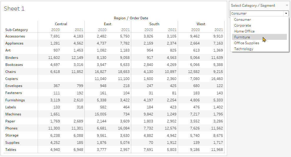


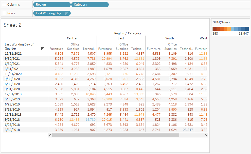


Tableau Practice Test
The best Tableau practice exams built. Period. Explore definitive practical problems created by brilliant Tableau experts.