
Introduction
According to a survey, only 17% of the people have designers in charge of building dashboards, and just under 50% of the organizations have marketing managers. Because they give different stakeholders a concise overview of information in an easily readable manner, dashboards are an essential part of the analytics process.
The ultimate objective of a dashboard is to assist its users in making the best decisions possible and making the most of this constantly expanding data source. Checklists are the most effective angles that can help you maintain consistency and excellent practices effortlessly and straightforwardly.
While designing a dashboard there are multiple things to take care of. Checklists are handy while planning for dashboards to minimize any trouble. This way you can distribute work properly and make sure you don’t overlook anything.
Desktop Specialist
Learn more about Desktop Specialist Certification.
Data Analyst
Learn more about the Data Analyst Certification.
Server Certified
Learn more about the Tableau Server Certification.
Ready to contribute to the Tableau community? Get $30 for sharing your work and certification experiences. Write and get paid for every article. Learn more »

The ultimate dashboard design checklist:
This simple checklist will ensure that your dashboards are up to the mark, designed perfectly and deliver the objectives. Makes sure to give it a read and consider all these points while making a dashboard. This one simple step will make the whole process easier and more organized.
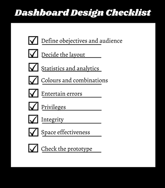
1. Define objectives and audience:
This is the first and the most important step. Get this right and you’re already halfway there. Sounds like a quote! right? But it’s true.
You must clearly define your company objectives and the metrics by which you will judge success. By doing this, you may create a process that is more focused on results. The middle-ranked leading business indicators cover a vast region, most of which are dynamically rich maps.
Secondly knowing your audience will make designing easier for you. You’ll know their level of understanding and what metrics are important to them.
Keep on Reading: Tableau Data Analyst Certification Questions »
2. Decide the layout:
There are many other layout options for dashboards, including single-column, multi-column, and report layouts. Layouts may help explain and simplify intricate representations and give your viewers context. Make sure to take into account the following elements while choosing a layout.
- Label axes and titles for clarity as necessary.
- Give relevant context for the ideas mentioned in the title or subtitle.
- Pick a responsive layout.
- Try to use labels to respond to frequent audience inquiries where appropriate.
- When appropriate, indicate significant data points.
- Keep crucial information in larger chunks to capture readers’ attention.
- When highlighting particular messages inside your labels, change the font size.
- Compare visualizations and tables side by side.
Keep reading: Tableau Desktop Specialist Certification Questions »
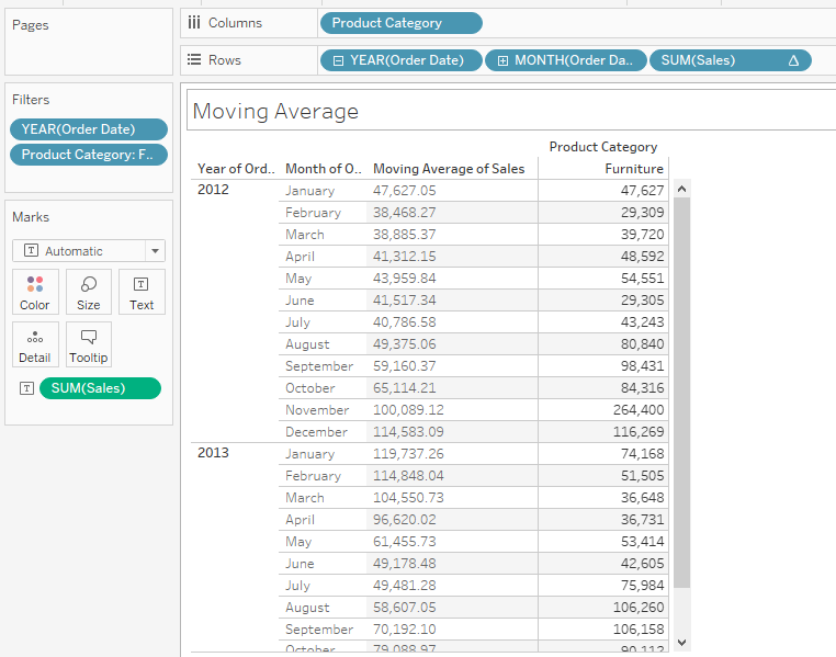
3. Data visualization:
If your dashboard calls for charts, graphs, and analytical presentation, ensure the design includes those elements. Across both sides of the screen, numerous supplementary indication charts are displayed. You can use drill-down linkage and a carousel to present the content of the auxiliary analysis.
You might need to perform certain computations locally for some charts. Therefore you’ll need the loading state to signal to the user that your program is functioning. Also, think about how you want a page to load—chart per chart or for the viewer to see all the data once it’s ready.
Data visualization is made more enjoyable by individualized features like map thermal display, dynamic flow display, flash animation, custom fill, etc. You can add filters to charts so the user can view past data and analyze it.
You can use multiple chart styles and types according to your layout. Some widely used graphs are:
- Line graph
The most popular and often used charts in business analysis are line charts. It shows how two sets of values—the horizontal axis and the vertical axis—relate to one another.
The greatest visualization method for discovering trends and patterns is this one. It displays the continuous change in a variable over a predetermined amount of time.
- Pie graphs
Pie charts require more room than line graphs do. Therefore your layout should reflect that. Pie charts may successfully explain numerical proportions because they can portray facts graphically as a small slice of a larger total.
Pie charts are wrong if there is a slight difference between the variables. Bar charts perform better in these circumstances.
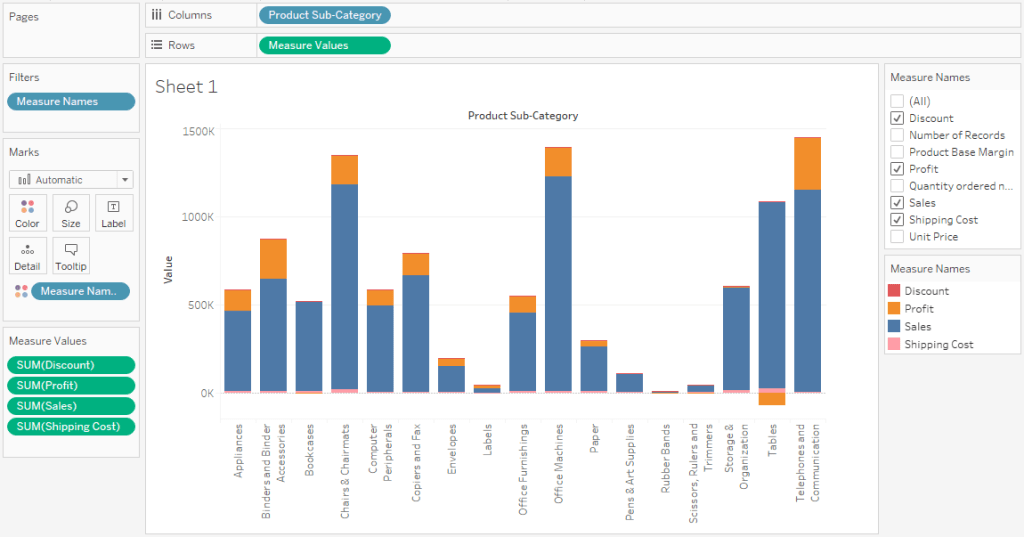
- Column chart
The most significant way to display differences between several variables, particularly when comparing them, is using a column chart. In some ways, column charts are the ideal visualizations because they use a distinctive sense of height.
4. Colours and combinations:
You may draw the viewer’s attention to a particular area by emphasizing or highlighting specific dashboard components. Use colour combinations evident to the viewer and not too brilliant to hurt their eyes.
With dark hues, you can draw attention to vital details. Don’t use bright colours on dark colours too often. Don’t forget to check for contrast, colour blindness, brightness, and text sizes. Verify whether your design system elements currently exist or whether you are required to add new UI elements, behaviours, colours, or text styles.
5. Entertain Errors:
Handle as many errors as possible, so the reader encounters as few as possible when using the dashboard. For instance, you must employ notifications to draw users’ attention if any change in the number of people requires immediate attention and action.
Don’t forget to account for any potential mistakes. If necessary, allow users to access further resources or a support section quickly. Provide proper animation for errors to alert the user.
6. Privileges:
Think about the two scenarios where a piece of data is missing for some reason or when the user denies access to the data. The data should reflect the privileges that have been given. Choose if you want to ban the user if they don’t have the proper rights, hide this item, or render it gray.
Turning the forbidden gray will still make certain text information visible. You must consider how users will access the dashboard based on their permissions.
7. Integrity:
The integrity of data must be preserved while presenting extremely large numeric quantities. This is crucial, especially when changing currencies would significantly alter the data people view. You must thus pick the appropriate style and data type to ensure that the numbers and data are accurate.
All screen resolutions should maintain integrity. The information displayed on a large screen should be the same on a smartphone or tablet. Numerical values should never be cut or shortened. Add the filter button for charts and maintain the integrity of old data.
8. Space effectiveness:
The first screen that appears in an application is your dashboard. The loading process shouldn’t take too long. The dashboard data should occupy as little space as possible to speed up the loading. The crucial information does not have to be removed to save space.
You may create the dashboard to use the least amount of storage possible without trimming significant values. Due to the limited storage on mobile devices, it is important to avoid chopping up massive numerical data.
9. Check the prototype:
After you’ve completed all of your design planning, it’s time to create the design. Following the development, you must test the design to ensure it performs as intended. To test a design property, create a clickable prototype.
To improve the quality of the user testing, try to include real data in your design. Ensure that all behaviours are documented and that collaborative tools are available to access the design.
Frequently asked questions:
1. Do dashboard designs vary widely?
The dashboard design will differ significantly depending on whose department you are making it for. Your audience should be one of the most significant considerations when using best practices for dashboard design.
To design the greatest analytical tool for the dashboard’s users, you must determine who will use it. The most popular dashboard designs have tables, animations, filters, graphs, reports, and privileges.
2. How can I make a text in my dashboard stand out as important?
Colour is a fantastic method to draw users’ attention to important words, phrases, or pieces of information in text boxes.
When adding critical insights to a dashboard, use colour to draw attention to particular phrases or figures connected to the data. You can draw attention to notifications, time, numbers, or percentages this way.
3. How does KPI dashboard design help in business?
Choosing the appropriate KPIs for your company’s needs is essential for designing a successful KPI dashboard. The ideal KPIs to include in your dashboard will be easy to choose after your final goals have been established and your target audience has been considered.
Your KPIs, which will show visual representations of pertinent information based on particular business sectors, will influence your dashboards’ direction.
In a nutshell:
This was a 9-step simple checklist for a data analyst for designing dashboards. This will give you a quick organization sweep and will arrange everything in order. Here is what we just discussed
- Define objectives and audience
- Decide the layout
- Statistics and analytics
- Colours and combinations
- Entertain Errors
- Privileges
- Integrity
- Space effectiveness
- Check the prototype
So the next time you’re designing a dashboard keep this checklist with you and see how smoothly everything goes.
Get our Most Popular Downloads
Download the most popular scenario-based Tableau Workbooks in .twbx format. Used by thousands of Tableau developers and job aspirants every day to improve and fine-tune their CV and Tableau Public profile. Join the largest Tableau Experts Social Group.
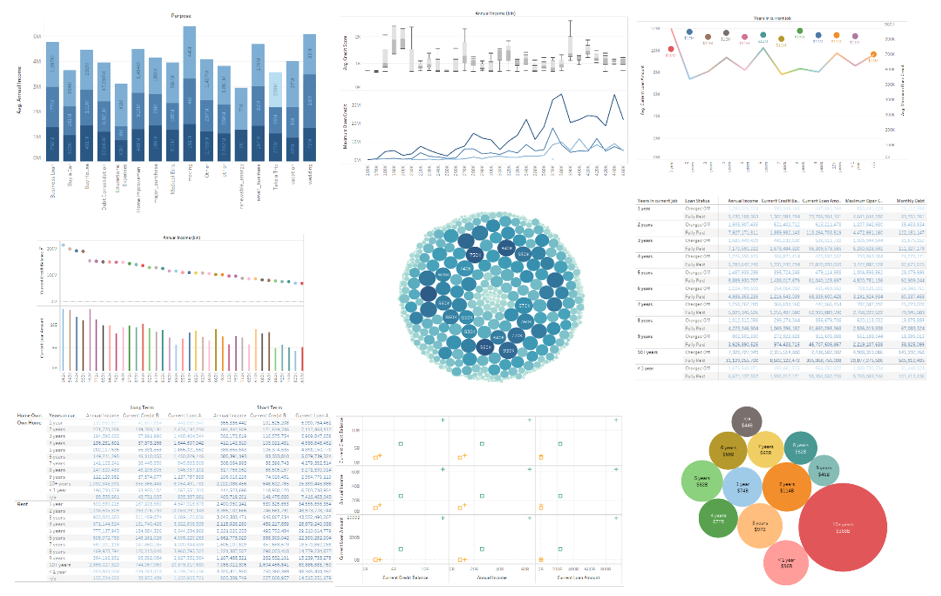
Banking & Financial Dataset Analysis
Financial Domain Tableau Dataset and Analysis. The most important domain in today’s industry. Analyze Key Performance Indicators. Discover Risky and Fraudulent Outliers. Download the Tableau Packaged (.twbx) Workbook. Includes a complete Financial dataset analysis. Enhance your Data Analytics experience with our skilled analysis.
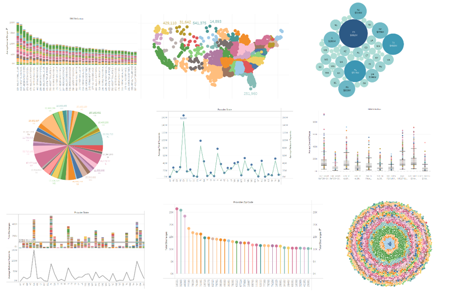
Healthcare & Hospital Dataset Analysis
Hospital and Healthcare Domain Tableau Dataset and Analysis. A key field of study with millions of lives at stake. The most sensitive industry today. Download the Tableau Packaged (.twbx) Workbook. Understand how healthcare datasets work. Includes a complete Healthcare dataset with analytical charts. Explore Tableau interactive features with this download.

Insurance Dataset Analysis
Insurance Domain Tableau Dataset and Analysis. Important domain specific metrics and data. Learn how to visualize important metrics. Show outliers and insightful data points. Download the Tableau Packaged (.twbx) Workbook. Includes comprehensive analysis of Insurance data of a large sample population. Uses industry standard analytical practices.


First Working Day of the Quarter
Get the Tableau Workbook identifying the First Working Day of any Quarter of a Year.

By the Editorial Team


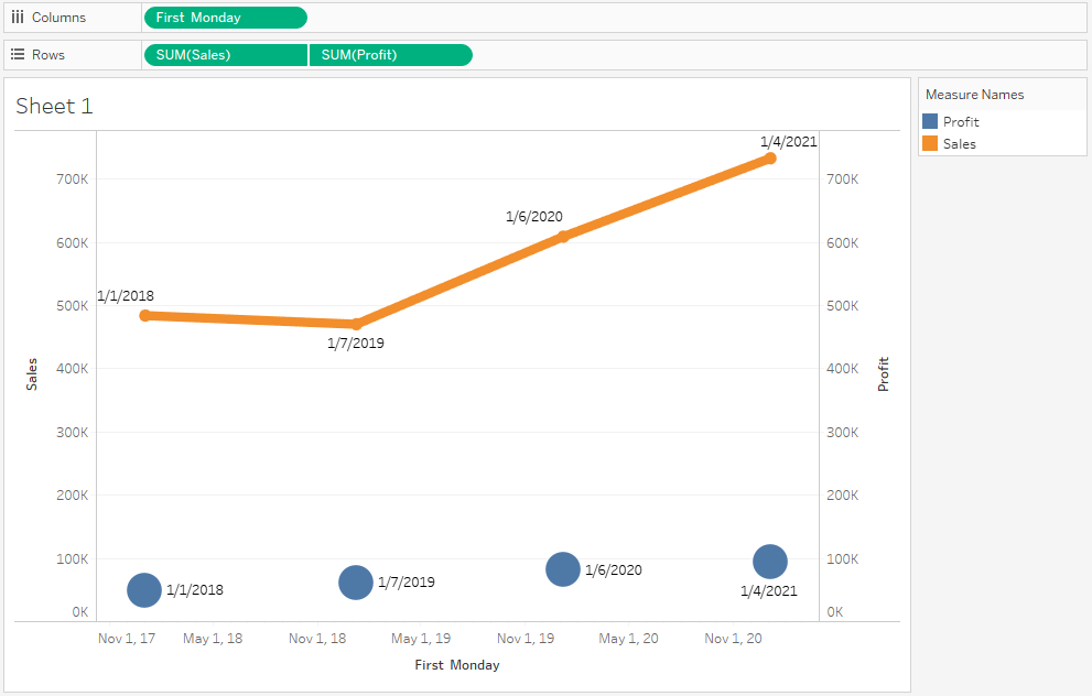


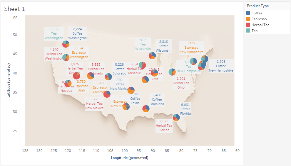


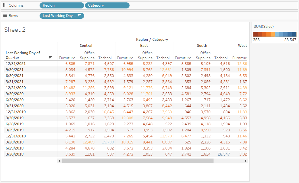


Tableau Practice Test
The best Tableau practice exams built. Period. Explore definitive practical problems created by brilliant Tableau experts.